Making the Most of CGM: Uncover the Magic of Your Ambulatory Glucose Profile
By Frida Velcani
 What’s an AGP report, and what does it show? Why does my AGP matter? How can I use an AGP report to improve my blood glucose levels and time in range?
Having diabetes is a full-time job: you have to simultaneously monitor your diet, activity, stress, and even sleep. On top of that, you need to calculate and manage the number of carbs you consume in each meal, and keep careful tabs on your blood sugar levels. The Ambulatory Glucose Profile (AGP) report, developed by the International Diabetes Center, is a tool that provides a simplified way to look at data on your blood glucose patterns and trends. It has been recognized as a standard of care for reporting continuous glucose monitor (CGM) data by the American Diabetes Association. In this article, we explain what an AGP report is and how you can use the information to help you navigate your diabetes management.
What is an ambulatory glucose profile report?
An AGP report is a standardized, single-page report that includes glucose statistics like time in range, a summary glucose profile, and daily glucose graphs. It converts blood glucose readings from a CGM device into a detailed picture, allowing you to quickly visualize the time you spend above and below your target range. The report is based on at least seven days of CGM data, with 14 days of data (or more) considered ideal. Currently, many CGMs include a version of the AGP report in their devices and reporting software.
An AGP report that summarizes data provided by self-monitoring of blood glucose (SMBG) is currently being developed. This article focuses on CGM AGP reports.
Why does my ambulatory glucose profile matter?
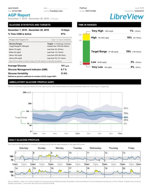
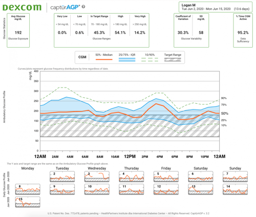
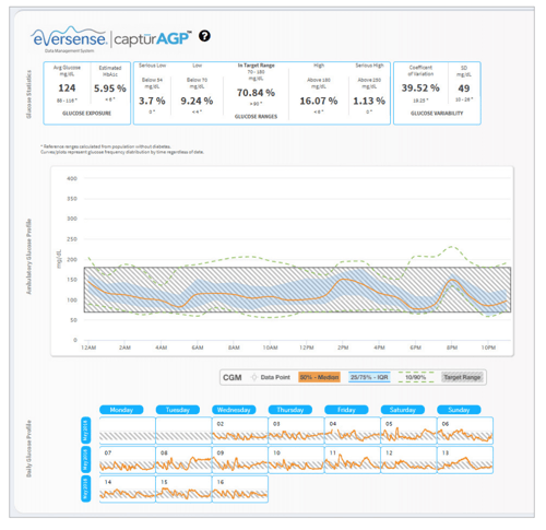
The AGP report is the same no matter what device you use – it allows your healthcare team to assess blood glucose levels and trends in a standard way for everyone they see. Below you’ll find sample AGP reports from Abbott, Dexcom, and Senseonics.
The AGP report shows patterns in a user-friendly way so that people with diabetes can easily identify the times of day when glucose levels are consistently low, high, or fluctuating. The general goal for people with diabetes is to have their glucose levels stay within the target range of 70 to 180 mg/dL for at least 70% of the day, spending less than 4% of their time in hypoglycemia (under 70 mg/dL). The information from an AGP report can help you have a discussion with your healthcare team about goals for your diabetes management and ways you can achieve them. The data offered by this report can help make your care far more precise and effective.
What exactly does your AGP show?
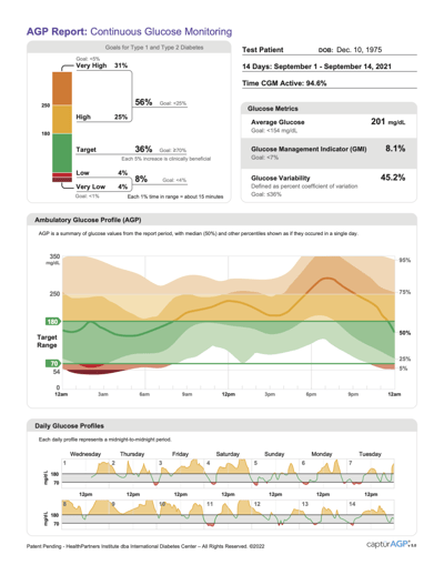
The standard AGP (designed by the International Diabetes Center and shown above) will show your data like this:
-
Glucose Metrics: This section displays metrics, including average glucose, glucose variability, and Glucose Management Indicator (GMI), which can be thought of as your predicted A1C. Above this section are the dates and number of days in the report, as well as the percentage of time that the CGM was used to collect data.
-
Goals for Type 1 and Type 2 Diabetes: This color-coded bar chart helps you visualize the percentage of time spent above and below your target range. While time in range goals can be individualized, the expert-defined goals for various groups of people with diabetes can be found in this section. You can read more about time in range targets here.
-
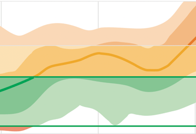
Ambulatory Glucose Profile: This graph combines all of your glucose readings over time to display your trends across a 24-hour period. At the end of this article, you can find examples of what this will look like for your specific CGM.
-
Solid line: the median of all the readings. Half of your glucose values are above the middle line, and half are below.
-
Darker shading: 50% of your glucose values lie in this area
-
Lighter shading: 90% of your glucose values lie in this area
-
Green: this is the time spent in your target glucose range (usually between 70 and 180 mg/dL)
-
Yellow: this is the time spent in a high glucose range (between 180 and 250 mg/dL)
-
Orange: this area near the top of the graph is time spent in a very high glucose range (above 250 mg/dL)
-
Red: this area near the bottom is time spent in a low glucose range (between 70 and 54 mg/dL)
-
Dark red: this area at the bottom of the graph is time spent in a very low glucose range (below 54 mg/dL)
-
Daily Glucose Profiles: Each box shows your glucose pattern from a single day.
-
Green line in gray area: this is time in your target glucose range
-
Yellow area: instances of high glucose (hyperglycemia).
-
Red area: instances of low glucose (hypoglycemia).
How can I interpret an ambulatory glucose profile report?
An AGP report combines several days of blood glucose readings into one snapshot. Once you have identified daily patterns, you can work with your healthcare team to adjust your medications and insulin dosing to spend more time in range. You may also discuss the timing of food or physical activity, what you eat, or ways to reduce stress.
Dr. Richard Bergenstal, the executive director of the International Diabetes Center, created a two-part video tutorial on how the AGP report came about and how people with diabetes can interpret their data:
Here are some steps you can take to understand your data:
-
Look at your time in range. The goal is to shift the numbers into the 70 - 180 mg/dl target range while having fewer lows and extreme highs. Each AGP report includes a bar chart of your time in range; one way to see this goal in action is to aim for more “green” and less “red” on the bar chart.
-
Keep track of the usual times you wake up, go to sleep, eat meals and snacks, and are physically active. Food, activity, medication doses, and dozens of other factors can affect your blood glucose levels. Recording these activities and their timing will help you understand your AGP report and the patterns you see.
-
Identify times when your glucose levels are lowest and highest, and look for times of more variability. Speak with your healthcare professional about what factors may be causing highs, lows, and variability in your AGP and how you can reduce them. The wider the shaded blue areas on your report, the more variability there is in your glucose levels.
-
If you can, compare your current and past AGP reports, and create an action plan with your healthcare team. What strategies did you use previously to make changes? Identify a few steps to improve your glucose patterns moving forward.
To learn more about how people with diabetes and healthcare professionals can use AGP, click here. For more resources on time in range, check out diaTribe’s comprehensive library here.
This article is part of a series on time in range.
The diaTribe Foundation, in concert with the Time in Range Coalition, is committed to helping people with diabetes and their caregivers understand time in range to maximize patients' health. Learn more about the Time in Range Coalition here.